Lights, Brushes, Shade!

Alright just playing with some simple lighting, trying to get down, well lighting!  So I have a baby that I made! Yes I am proud of this baby!  The outfit was designed off of a star in my mind!  And the head just a random quick doodle of a head, I was testing how it would look to squish all the face features together.  (Eyes, Nose and Mouth)  Kindof cute!  So first is just the line art, second is me playing with color, 3rd is me taking the line art and shading with the same color.  I know it’s not black it just was the color I started the face on and I just stuck with it.

Any Tips or advice is always welcome!  Shading has always been a tough spot for me!


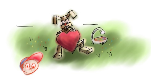
Treats with a heart made of metal

The robotic bunny in this latest robotic twisted adventure I have taken.  Why Robots?  Not really sure, I saw a book on some technique to drawing robots, and as my robots are awesome with in the palm of my Wacom, they do not render out so well.. This might be cause I only previewed the book on the amazon site.  So to continue this edition of Adam and Robots!  The Valentines Robotic Easter Bunny!

The smiley there was just me goofing around!  I took my concentration off the bunny, so the bunny looks mad at the self portrait!


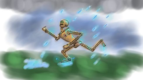
Rain = Rust = Run The Robotic Way

Another quick sketch, A robot, some rain, and massive running action.  I spent a little more time to get the lighting correct on this one then Rocket Robot!  The water effect on the other hand are less then desired, but it’s a doodle!  Was a quick sketch while waiting for a render to complete.

Run Away!!!


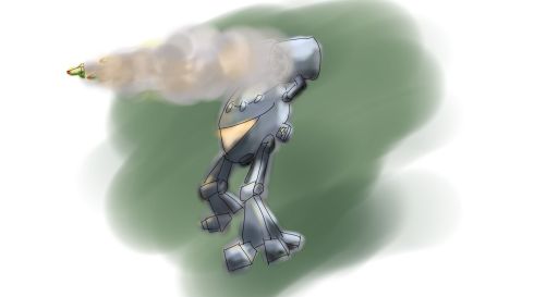
Rocket Robot! I’ve been so far behind!

While waiting for a render I realized I’m really behind in my blog! So I doodled up a rocket robot!  Yes the lighting is whacky, and drawing is very sketchy and odd proportions! But it’s a doodle either way! hah!


Drawing and Selling Cartoons Lesson 1.1 – Let the Challenge Begin

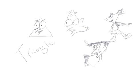
Alright this is 1.1 because in that last excersize I totally missed the triangle, So I made several faces… It looks like a flare of Dr. Doofenshmirts and Phineas came out, as I do love that show!  But here it is!!

These are all rough and quick, I was just playing around, the more original would be my wine tasting frenchman!  The first triangle I felt a little Doofenshmirts in it, so I tried again.  All these drawings are from scratch no references.  Just playing around with the tablet and practicing my awesome cartooning skills!

I haven’t used the Wacom tablet for a while so getting use to the feel again but I still enjoy using it!  And again these sketches are done in Autodesk Sketchbook Pro.


Drawing and Selling Cartoons Lesson 1 – Let the Challenge Begin

Taking a book written by Randy Glasbergen “Getting Started Drawing & Selling Cartoons” http://www.amazon.com/Getting-Started-Drawing-Selling-Cartoons/dp/0891344713/ref=sr_1_1?ie=UTF8&s=books&qid=1303919463&sr=8-1 that has lessons on how to cartoon, I challenge myself to do them all.  That is right attempt to do the challenges, whether the art comes out good or bad.

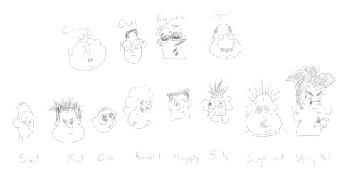
1st  Lesson is create a face out of a circle, oval, square, and pear shape… Oops I missed it triangle too! More to come later on that.

Part 2 of the lesson is write as many emotions I can think of and then draw that expressions using the one of the head shapes.

Here it is…

I found that I have some problems with square (rectangle) heads.  I don’t know why, maybe it’s just drawing inside the box.  But to me the faces always look like a face popping out of a piece of paper instead of being part of the head.  These are all quick sketches, as it requests that these are not final pieces of work, so it’s what I stuck too.  Though I might go back and color them for the fun of it.

Oooooppppsss…  I forgot to do the triangle, so that will come shortly.

This was all done on Autodesk Sketchbook Pro, I am still getting use to this over pencil and paper.


The FCP Color Picker: Warning Results May Vary

Greetings and welcome to the Great and Fantastic Final Cut ProSelect Color” Show!  Warning Results May Vary!!!

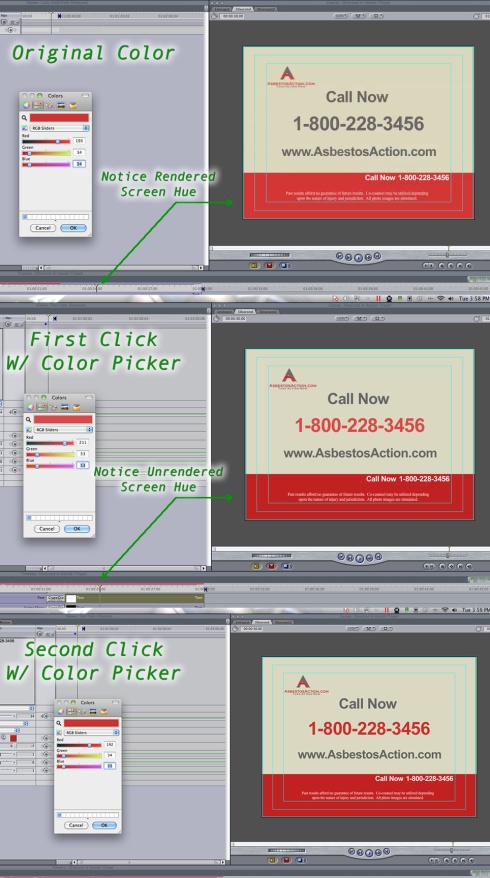
Working on the same project as my previous post, I ran into an interesting complaint from the client. “The red you have doesn’t match our logo as requested!”  Well I had the safety of, “well let me see I used the color picker to grab the red from your logo, perhaps I grabbed the red just to close to the boarder and picked up a slightly different hue.”  I click, BAAM!!, Gasp, Shock, Awe!  The color is way off…  Say what?  That is right folks, the Select Color does a great job, it selects color, just not the color you need or want.

Originally being a graphic designer, and knowing mac as the king for design, I was dumb founded… No really I was!   We live off of color picker/select color for all sources of colors that we don’t have the written code for.  So thinking it’s user error I had to run a test.

The client later request they wanted the phone number to match their logo color which also happens to be the color of the big red bar at the bottom of the screen.  Great a big target to choose from no error this time.  So I grab my select color tool, and capture the phone number’s color from gray to……

…… Well Red.. but not the right kind of red!  Actually quite a bit different red, enough that the client noticed!  Wait the select color in Final Cut Pro gave me the wrong color, not only that it shifted the color red on the bottom bar to be a closer representation of the color red I needed.  So I desided to take the select color tool again, and click once again on the big red bar at the bottom of the screen.  WOW!!! we have the same color…..actually not, wait what?  Yep the color is close, really close.. But still off by a hair.

Original: R:193 G:34 B:34
First Picker: R:211 G:53 B:53
Second Picker: R:192 G:34 B:33

What does this mean?  When using color picker/select color with Final Cut Pro you need to either use the color picker twice on the same area to get a “close” to accurate version of the color needed.  If the clip is unrendered, well then you should only need one click…. to get close….

Good luck and pick your colors safely!


A Bold Pain! Final Cut Pro Strikes Again!

The Act of Bolding: To simply make a section of type stand out by thickening the letters.  (Also known as Letter Steroids to some.)

People think I have a passionate hate for macs, and well for apple based software.  I now work on it daily, and I have to say I don’t have a hate, what Apple products do, they do very well… But that is it.. Such as, Final Cut is Non-Linear Video Editing Software, and it’s very solid Non-Linear Video Editor… But that is it, when it comes to post production, graphics passes, text passes it becomes crippling.  They expect you to open up Motion to do all the final touches, so introducing a second program to help the first.  This is common with a lot of programs, but when it comes to the point of opening a second program it is to bring in some jazz, some simply awesome stuff.  Text isn’t just sitting their, it’s dancing, sliding moving.  Things are being composited to create a layered master piece that could only describe and ogre’s feelings.  Todays Final Cut Wall I hit is the act of bolding a simple word or two in a section of text.

Here is the problem as quoted from Larry Jordan http://www.larryjordan.biz/articles/lj_credits.html

“Final Cut’s internal text generators only allow one font, point size, and color in a single clip.”
Now mind you this was written in 2006. Step ahead to 2011, still Final Cuts text generator is limited by the same thing.

Now here was my problem, working on a commercial I have to create one sentence of text “Our priority is to deliver the exceptional results each client deserves” with the bolding as marked exceptional results.  In Adobe Premiere this is one text element in their internal title generator.  In Final Cut it’s 2 elements and lots of silly spaces.
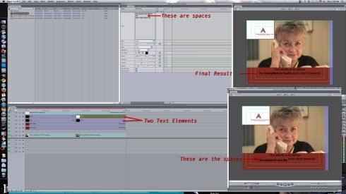
Check the arrows and Description and I'll Explain Below

Basically I have to create two elements, first typing in the full sentence so I can get a position of where Exceptional Results belongs and what the full sentence is.  Then I have to create a second text element that is just Exceptional Results, make sure it’s the same type face and same size due to final cut changing back to default font (or you can copy and paste and delete everything you don’t need)  Then you have to manually match up the letters to make sure you are not to low or two high.  Now click bold!  We are done!!!  Wait we are not, I still had the non bolded word below!  Going back into the first text element I delete the words exceptional results, YAY!! We are done… sigh.. nope this is going to be like the ending to Return of the King..  Now exceptional results is overlapping the each client deserves, so you have to then put spaces between “the” and “each” till “exceptional results” fits with the correct space point size.  Yes we are done.  Yes it’s ridiculous.  Yes Final Cut is good at editing… and that is it…  Next frame is the same problem new line of text, plus part of it bolded except I have to also add a 3rd text element.. why?  because there is a phone number too.  3 text elements, for 1 sentence, 2 words bolded, and a phone number.. Adobe Premiere? 1 text element… priceless


Prader Willi Syndrome Nation Campaign Logo Part 3

Well if from the last post you didn’t guess, Mo was the winner of design.  It created a character for them versus a stick figure that anyone else could use.  So the solution of what Mo to use? or to use them all?  Well I put together a series of logos, using their themed colors and building all sorts of layouts, as per requested.

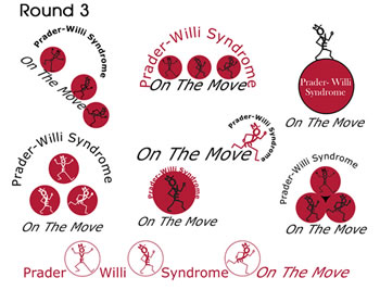
The Final Few Logos

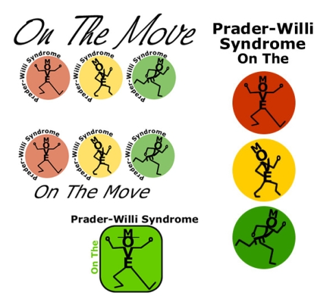
Using the colors I decided to try a few versions of it, thought he last idea I had was the bottom selection, white center with the red outlines. Which I do like the look of.  The top left came out to an interesting P.  They wanted to see the character alone, and the characters together, plus thinking a lil outside the box, as Mo is walking on the circle.  This is usually my final stage before tweaking the final logo.  This gives the client what they want, with the colors, and feel, just variations of the same thing to choose between.  The final step is taking the top 1-3 logos and making very minor tweaks to each.  But due to the same features I am simply posting up the final logo they chose and this is the finished version.

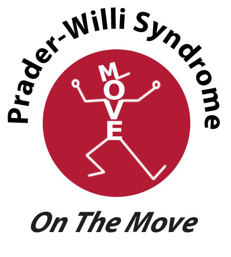
This is the final logo minus a few minor tweaks

Using their preferred font this is the final logo, a few minor changes have been made to clean up the softness of the arms and legs.  All the logos are created in Adobe Fireworks, as this is my favorite program to work in for things like this.  For CMYK output I usually render a high quality PSD and put it in photoshop to turn it into a CMYK JPG or PSD file.  You can also output it for Adobe Illustrator and Keep the vectors for banners and t-shirts.  This concludes the Prader Willi Syndrome Nation Campaign Logo Recap.  For more information about Prader Willi Association please visit: http://www.pwsausa.org/


Meet Mo (A Logo on the Move)

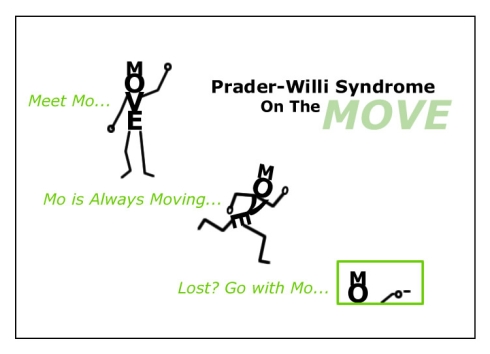
Meet Mo, yes the Prader Willi Association Board http://www.pwsausa.org/ chose the design of Mo for their national campaign logo.  Of course it’s none of the Mo’s you will see in this post.  But this post is more about the idea and evolution of Mo.  Mo is an incarnation of round 1 Prader Willi Syndrome Nation Campaign Logo Part 1 set of logos.  Yes hard to believe, but the character using the word MOVE with dancing legs is what pushed the idea, and furthered the concept.

Meet Mo, he helps you

Now what is so special about Mo?  Well a few things, 1 he’s not a stick figure that everyone else can use.. He is now a brand.  The concept and challenge behind Mo is to not just have a static logo.  But to have a logo that can be used in many sorts of ways, yet everyone knows that it’s Prader Willi Syndrome National Campaign Logo.  This idea derived from refreshing up on logo skills with “Logo Design Workbook” . Basically you create a logo that can be changing but you keep consistant elements. For the example they used, Nick Jr, uses an adult and kid animal in a specific pose, but change up the animal or even replace with objects (such as a spat) but the colors stay the same along with positioning.  Well Mo is the character, and he has the ability to move around, point things out, wave, what ever you need him to do.  He can Shape and Evolve to what they need at the National campaign as the example above shows.  He can be a tour guide, signs posted with just MO, and a finger pointing, along with the title of the class or meeting.  He can hold a healthy plate of greens to help enforce a topic of healthy eating for people and families that have Prader Willie Syndrome.  This was a challenge I wanted to take, create an evolving logo, something that can be used in any situation, but is not static.

The Original Ideas of Mo

Most of the original concepts of Mo was red, yellow and green light.  Basically stop, caution and go.  Or different speeds of moving.  Though Mo in yellow circle is one of my favorites, the idea behind him is actually the Burger King King.. yes from one of his first commercials when he’s sneaking around.  The bottom Mo I knew wasn’t a design to be picked, the idea was more to show that with a simple line he has a hat, not a crown.  Granted it’s a lil western or amish feeling.

Meet Mo… a Logo on the Move